My job is a continuous gym: sometimes it proceeds smoothly, without complications and in a constructive way, other times the realities are more complex and it is more difficult to reach a goal.
With the evolution of digital visual designer activity has become more and more articulated, as specific as it is wide: integrations, correlations and resolutions are constant variables, communication needs change daily and the times, more and more restricted, require continuous parallelization of activities.
How to present the project using a limited number of visuals? What is the best approach to define a winning concept and that meets customer expectations?
The dialogue between designer and client is the first of the tools necessary to achieve the objectives, more or less conventional means can be used to feed it and find a common language. Below is a brief overview.
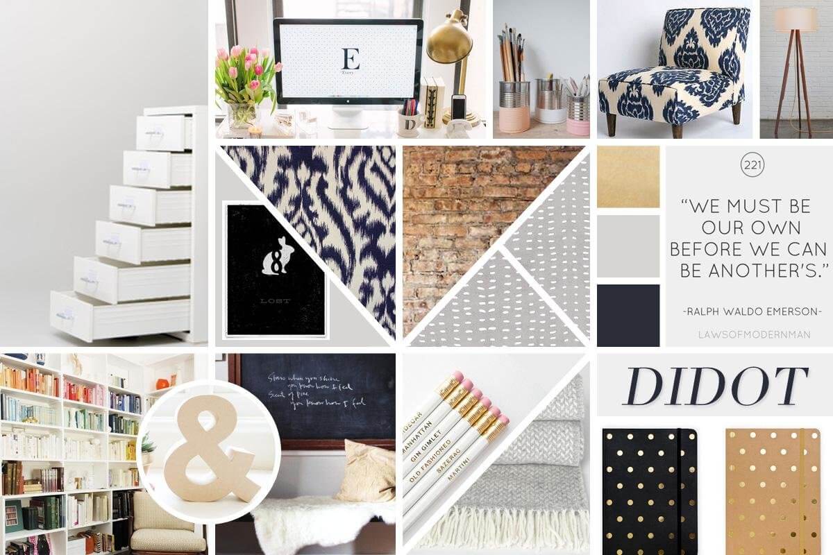
Mood board
It is a graphic elaborate composed of a table of images joined together, useful for communicating an atmosphere, a mood (mood) or a sensation. Each mood board will be able to collect the essential components that will characterize the project in its future, such as the feeling, the colors and the tone of voice that you want to attribute to the design.
The main objective of the mood board is to stimulate dialogue with the customer: through the different communicative registers values, elements and key words can be defined, which are the foundation of the project itself. Thanks to the poorly defined nature, they are presented in parallel, at an early stage of the project, to broaden the panorama of choices and help the customer in defining his digital identity.
Although it may seem highly abstract, the mood board answers fundamental questions such as:
- What kind of communication cut do we want to give to the visual? Modern or classic-institutional?
- Which images do you use to communicate the product? Real-life or post-produced?
- Is it preferable to use photos or vector compositions?
Although in an embryonic phase of the project, the involvement of the client will benefit the totality of the project: by proposing well distinct and clearly articulated alternative solutions, it will be possible to create a brief-in-progess based on the comparison of the same, on initial impressions and on sensations convey through the entirety of the layout.
The mood boards are relevant tools in the kickoff phase for two reasons:
- the effort required to create them is much lower than a detailed mock-up,
- help reduce the chances of a meeting failing.
The opportunity to build a path together will give the customer the perception of the project, and will give value to every single brick that will compose the digital strategy designed for him.

Style tile
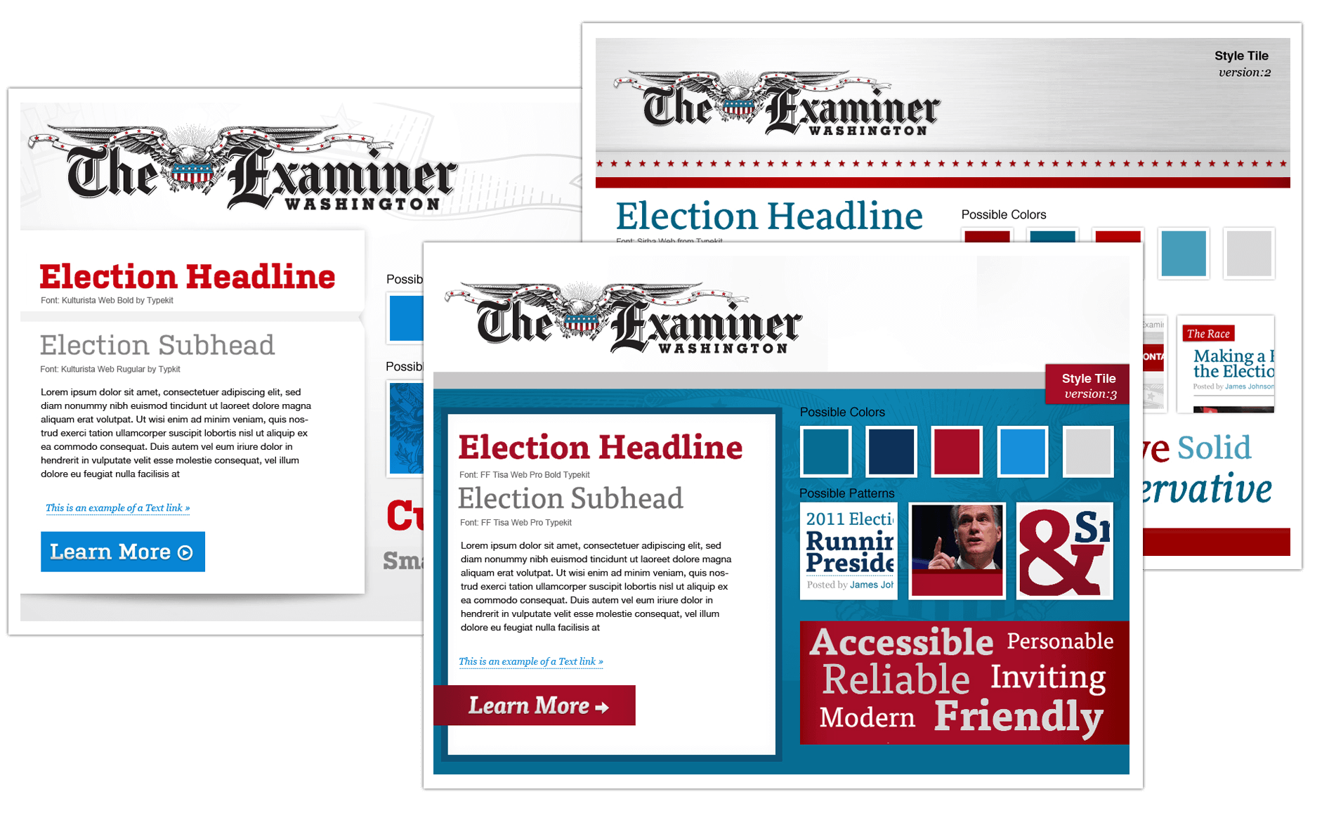
Designed by Samantha Warren, the style tile is the next step towards defining the visual.
Like the mood board, it is a flexible work that does not require a priori design: although the degree of detail is much higher than the first, the independence from mock-up allows to focus the interest on the deliverables related to the interface.
The definition process takes place by elaborating three distinct types of tables: breaking, moderate and conservative;
At each table are assigned keywords that will guide the designer’s choices, helping him to identify the most realistic and characteristic features of the layout: study of typography, visual hierarchies, weight of colors on page and basic structure.
The objective of the style tile is the identification of the style of the elements that will compose the visuals in the subsequent phases of design.
The project will take shape by intervening on:
- design elements: call-to-action, lines, image processing, shapes, backgrounds and spaces
- design principles: graphic grid, color harmony, balance and rhythm
that best convey the totality of the brand.
The use of the style tile is recommended when:
- the visual language must be defined
- revision times are limited
- the concept is studied in parallel with the design
 An example of style tile designed by Samantha Warren
Style guide
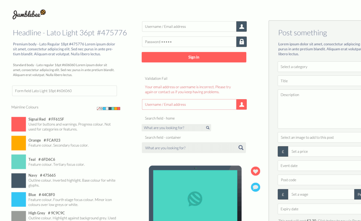
The style guide is typically used to define all the visual elements that cross the promotional materials of a company, including the website. The purpose of sharing guidelines is to build a solid and integrated image of the brand, with a view to evolving, increasing content and developing new features.
The manual is usually addressed to graphic designers, web developers and marketing managers within the company and can also be consulted by professionals who contribute to the development of communication and identity.
In the style guide the elements, the interactions and the graphic patterns necessary for the characterization of the visual are described. In detail, the key factors and information regarding:
- Typographical choices: fonts, dimensions, line-height, hierarchies
- Color scheme: use of patterns, backgrounds, texts, elements of interaction
- Graphic cage: page settings, off-grid elements
- Figurative language: images, icons
- Tone of voice
The style guide is a document that, if constantly updated, maximizes the recognition of the brand on and off-line, it is a historical memory that justifies the choices and allows designers to follow shared paths reducing the rework in the graphic / design composition phase.

Once the key elements and the characterization principles of the brand have been identified, we can proceed with the detailed design, the master templates and the pages.
Conclusions
The three instruments described above can bear good fruit both when used consecutively and in isolation. Although they may seem like premature contact methods, thanks to the constant comparison with the customer, the construction of the layout will benefit from fluidity, speed of execution and probability of success.